Unified Data Platform UX redesign
I guided the UX vision and research initiatives to mature a unified data platform into a flagship SaaS product. Leveraging my product understanding and strategic thinking, we delivered 100+ screens and 8 complex ETL modules. I aligned stakeholders and shaped an intuitive enterprise experience for a high-stakes presentation.
Note: I've left out the company's name to respect confidentiality and keep the focus on the work rather than any brand associations.
This Unified Data Platform was engineered specifically for Data Engineers, providing enterprise-grade tools in a single, cohesive ecosystem. For this redesign, our strategy focused on these modules, which we will be covering in this case study:
Extract Transform Load (ETL)
Enables users to efficiently extract data from complex sources, apply custom transformations on that data, and seamlessly load it into targeted destinations.
Advanced ETL
This Advance version of ETL empowers Data Engineers to build complex transformations and data pipelines with a drag-and-drop Apache NiFi canvas.
Change Data Capture (CDC)
Automatically captures modifications in source tables and synchronizes them across connected databases to ensure real-time data integrity.
Analytics
Transforms processed data into actionable insights, with fully customizable dashboards for complex data visualization.
Beyond pushing
pretty pixels
We were a team of 12 people, including 3 designers, 6 developers, and 3 QA testers.
Among designers, I had the most amount of product knowledge, so I was the idea man. Here is my role breakdown:
My Effort Breakdown
1. Breaking old patterns
This redesign was of software which was primarily designed by non-designers. The thinking behind that was of the product owner we were working with. He had been working on this product for a couple of years.
After closer inspection of the information architecture (IA) and user flows, we found several fundamental flaws in the design. These fundamental flaws were the main cause of inconsistencies and poor user experience in the product.
Challenge
- Unnecessarily long creation flow.
- Information division into multiple screens, causing an increase in cognitive load.
- Long steps to perform basic actions.
Solution
- We changed the structure of the application.
- Updated the design end-to-end.
- Advocated for the users as much as we could.
2. Tight deadline (2 months)
Redesigning six complex modules within a strict two-month deadline required a massive shift in our workflow. To deliver on time, we had to prioritize our efforts and leverage third-party components instead of building everything from scratch.
Challenge
- We had to work on 6 different modules.
- Our Design System was not mature enough to handle that.
- We didn't have time to develop complex components like Workflow and Grid.
Solution
- We prioritized modules so most of our efforts were spent on the important ones.
- We used third-party design systems named Untitled UI and Phosphor icons.
- We used third-party components like AG Grid and Apache NiFi.
.avif)
Outcomes
- This allowed us to focus on the most important parts so things like component design were outsourced.
- We learned the importance of off-the-shelf solutions and realized how they speed up our workflow.
3. Stakeholder leadership
Leading stakeholders is one of the most important parts of the design process. In this project, there were multiple stakeholders. This made the approval process lengthy because everyone had different opinions and wanted to tweak the solution in their own way. To tackle this problem, I follow a checklist which keeps me on track so I do not present ideas unprepared:
Product understanding
Invest time in understanding the product, industry, and the user before meeting with the stakeholders. This helps in building trust and allows me to ask the right questions.
Identify the decision maker
Every problem is different, so to get approval we must present the right screen in front of the right person to get the best feedback and valuable approval.
Putting your ego aside
To take our design to the next level, it is crucial for us not to get attached to our own designs.
Data backed presentation
Stakeholders are busy. So it is crucial for us to present our designs with good examples and research to back our decisions.
Medium of communication
Every stakeholder is different, so it is crucial to understand their communication patterns and choose the right medium, like email, one-on-one meetings, PPTs, or messages.
4. Rapid learning
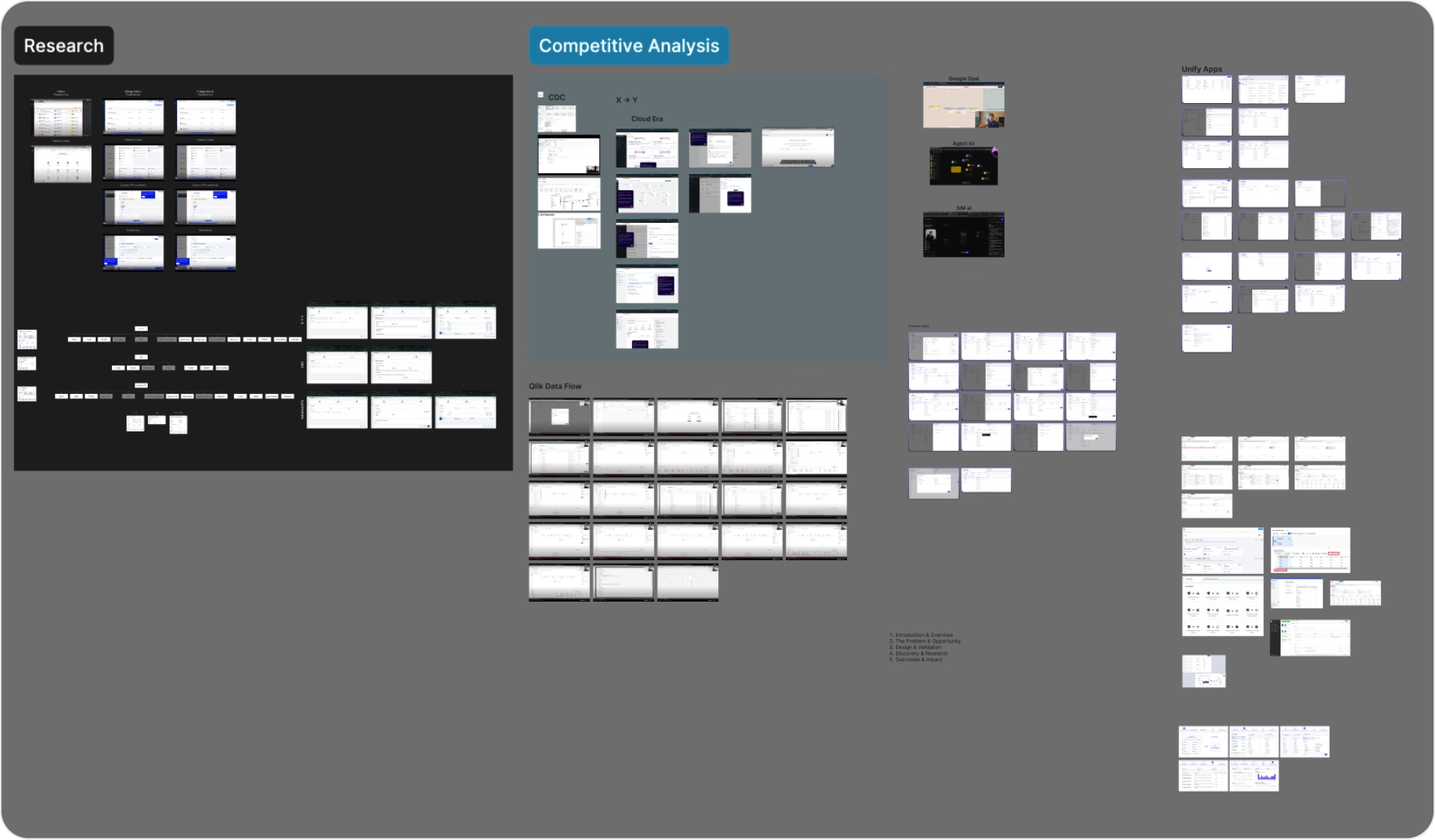
We studied applications like Hevo Data, Skyvia, Qlik, Cloudera, Unify App, Fivetran, Integrate.io, and more in our research phase. This was necessary to understand the landscape of the complex big data processing tool we were dealing with.
Challenge
- Sitting in front of industry veteran stakeholders with a background in data engineering.
- Challenging their beliefs and product decisions.
- Taking the product to its true potential.
Solution
- Become an expert, fast.
- Use AI tools like ChatGPT and Gemini for better product understanding.
- Analyze competitors for better problem-solving.
Building consistency at scale
There were a total of 100+ screens we were required to redesign. Every module was fundamentally different from one another. To redesign such a large solution, we needed to focus on one thing at a time, while making sure that the solution was consistent in the end. For this, my past experience with the application was quite helpful because I was familiar with the system.
The Lean UX
- Brief
- Internal Discussion
- Product Understanding
- User research
- Competitive analysis
- Documentation study
- Mid-fidelity prototype
- Alignment Review
- High-fidelity design
- Stakeholder Validation
- Revisions
- Developer handoff
- Recommendations
- Audit
- Revisions (if required)
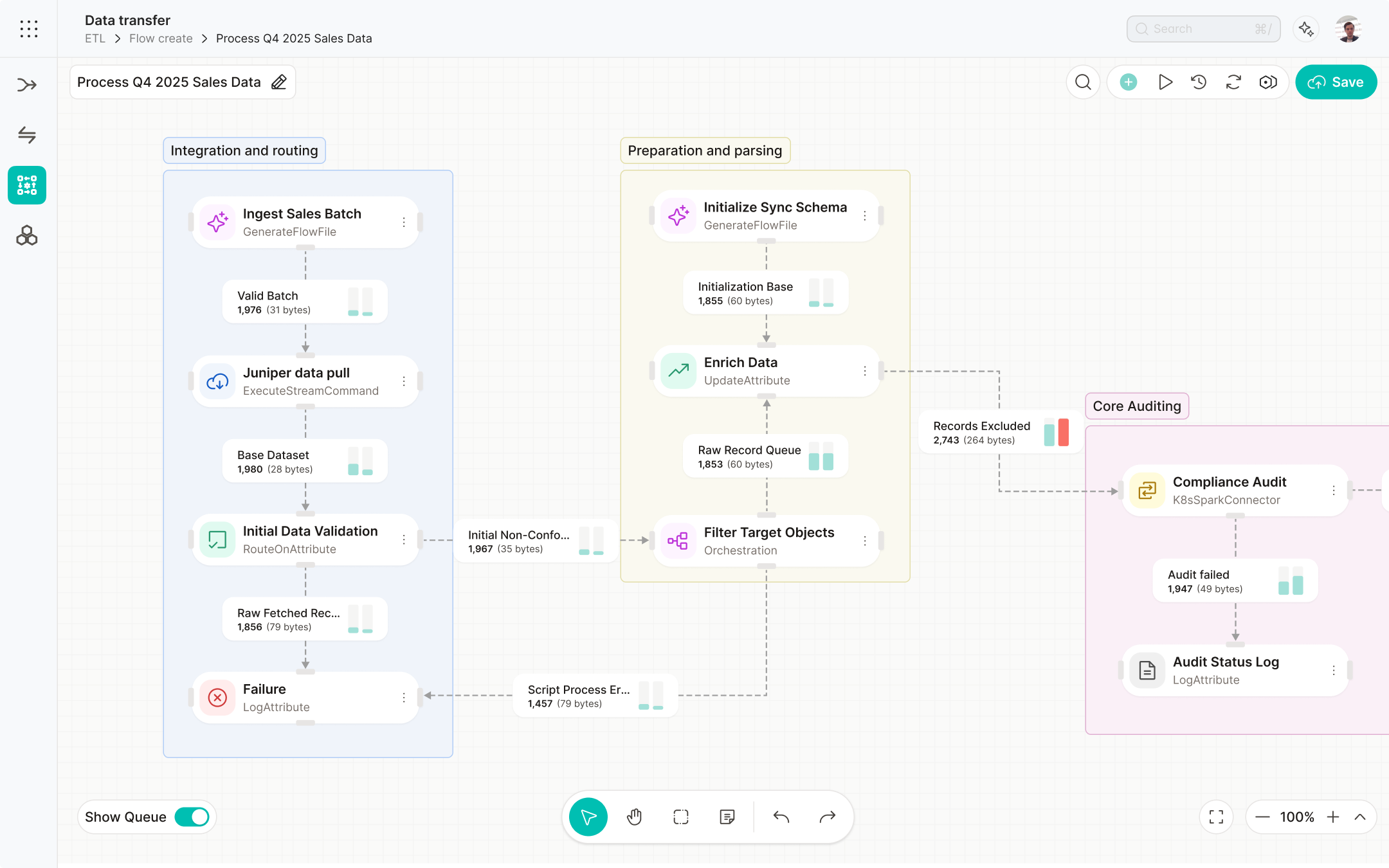
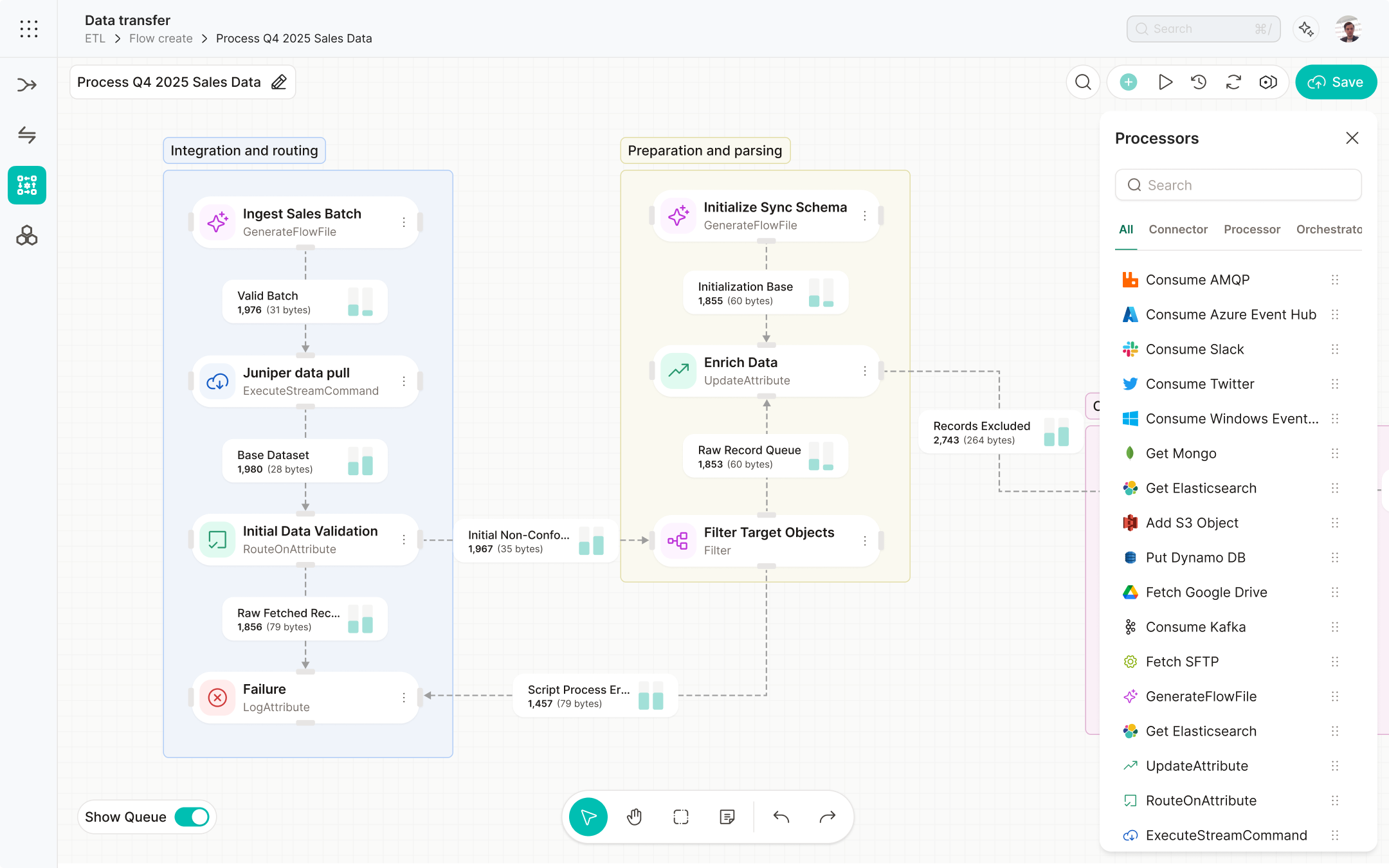
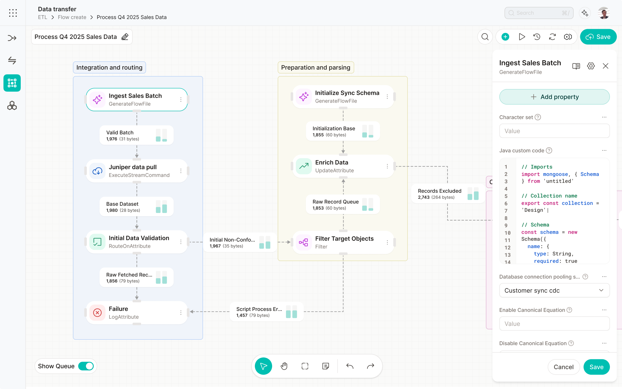
Advanced ETL update
The business strategy here was to achieve a wow effect from our client. We were already working with this client and we were trying to upsell this offering. To achieve this, we improved the User Interface of the application and worked on the complexity of Apache NiFi and improved it further.
Moreover, Advanced ETL was one of the core technologies of the Unified Data Platform and was the most powerful sub-module. Here we provided a simple drag-and-drop interface for the users to create data pipelines, powered by Apache NiFi.
Problems
- The old UI had a lot of distractions which made information hard to consume for the end user.
- It was outdated and didn't stand up to the competition.
- Important things were hidden which would be useful for the user based on our user research and documentation study.
Solution
- Did a complete redesign of the UI with a completely new design system.
- Studied Apache NiFi documentation along with some user research.
- Highlighted the important stuff and hid the rest in the new UI.
New UI
Old UI
.png)
New UI
Old UI
.png)
New UI
Iterations
Iteration 1
After discovering that our system was missing several key features, we came up with this design which showed almost all the information which NiFi has to offer.

Iteration 2
This was the second mid-fidelity version we designed. The vision here was to make the design simpler by removing the clutter.

Outcomes
The client was impressed and stakeholders were happy. We received a lot of compliments about our redesign in the client meeting.
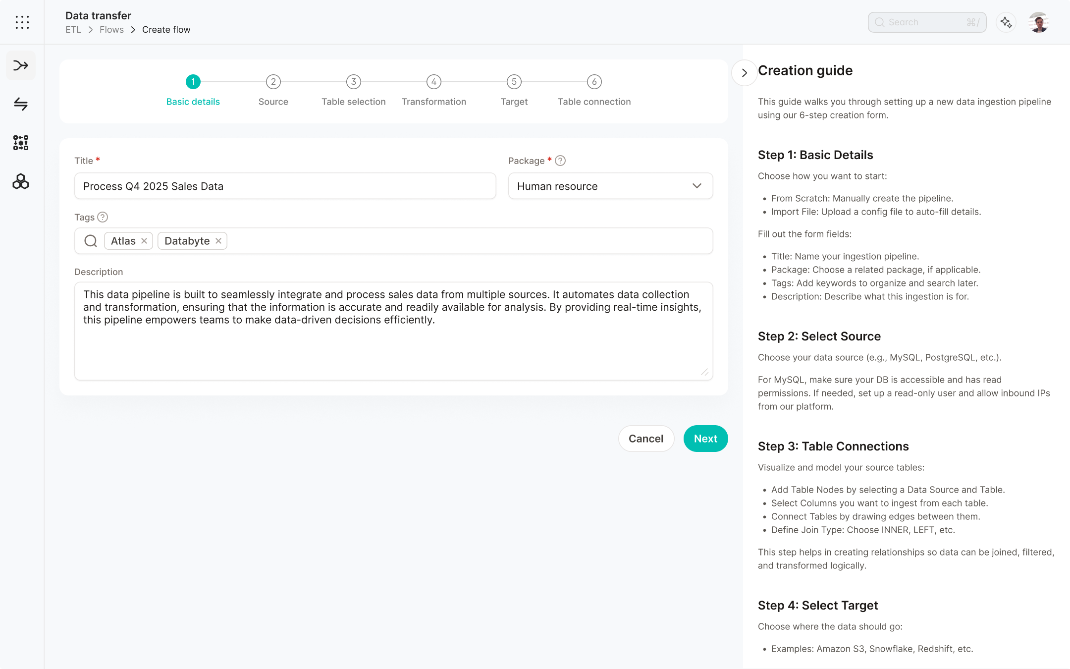
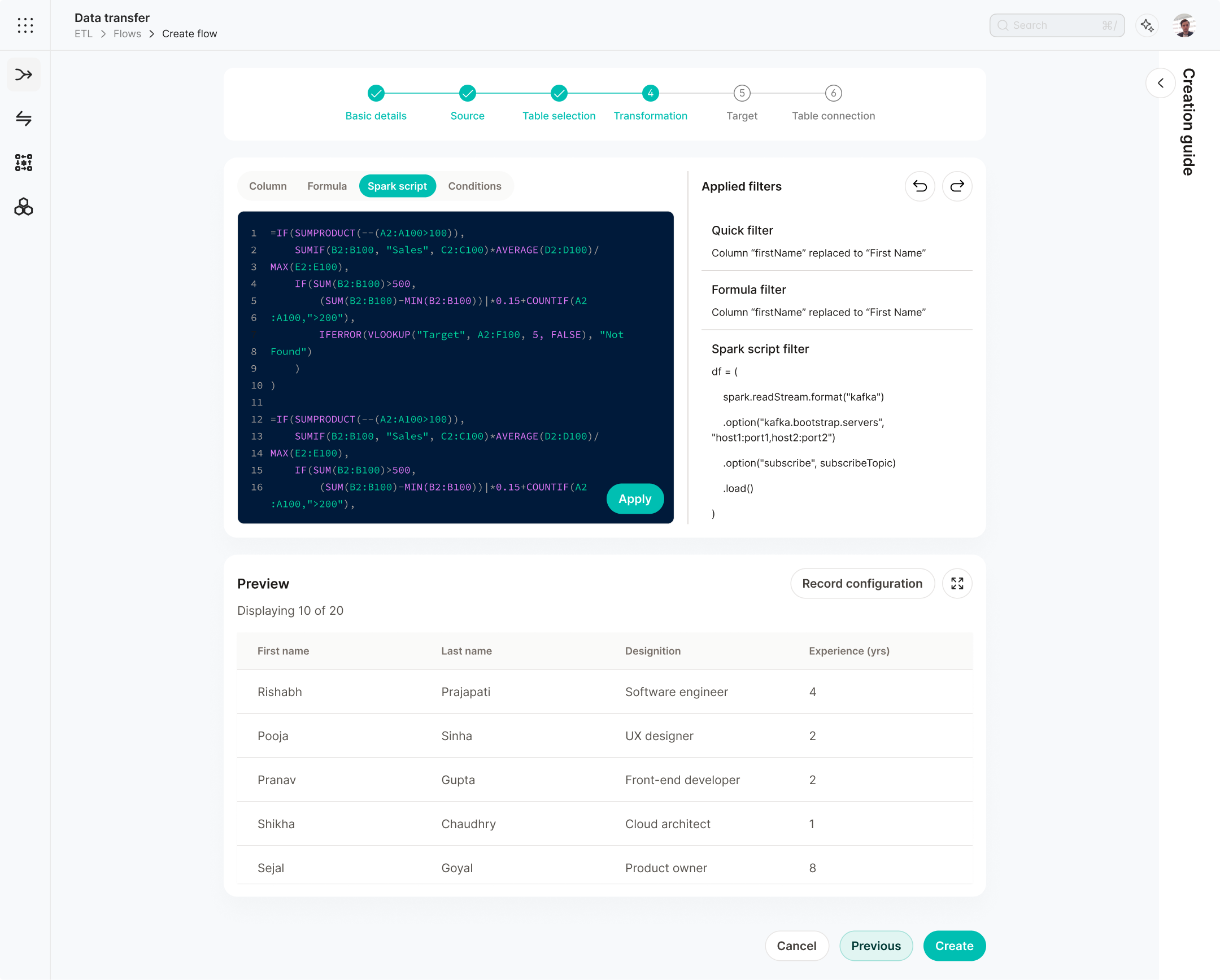
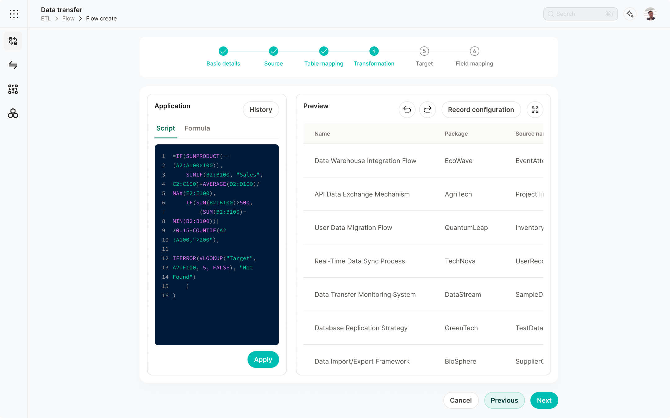
Flow creation update
Apart from the redesign, we also had to add new features to our transformation step. This was the product requirement provided by the product owner. For the redesign, we studied several of our competitors and found several ways they had managed the complexity of the UI. Based on that, we found these problems and solutions.
Problems
- Important features were hidden behind the poorly designed UI.
- Form was a bit too complex for a beginner user to understand and use.
Solution
- Identified and streamlined the high-priority features and nested less important features behind secondary actions.
- Added inline guidelines to improve the understanding for beginner users.
Iterations
Iteration 1
This was one of our first approaches to solving the problem by keeping the UI minimal. However, it missed several key features and made the process more hectic for the user.
Iteration 2
This was one of our first approaches to solve the problem; it was not perfect, but it was a step in the right direction.
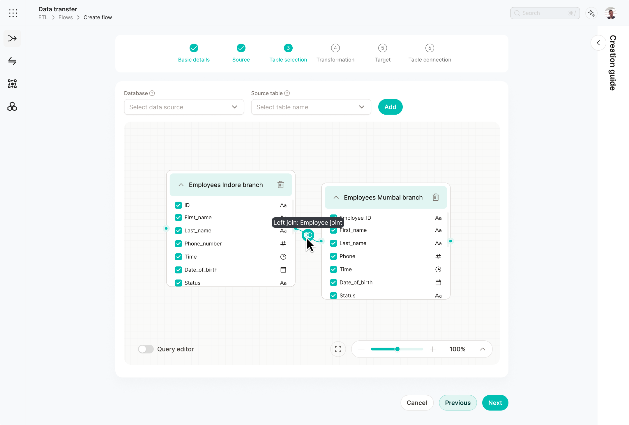
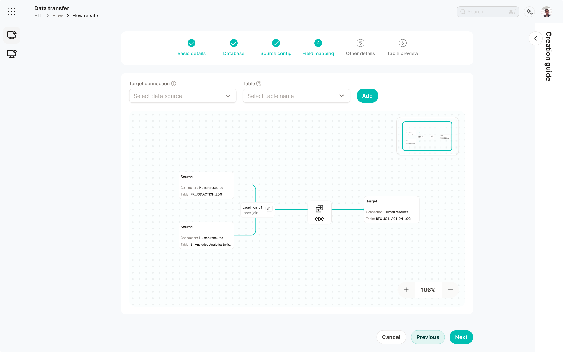
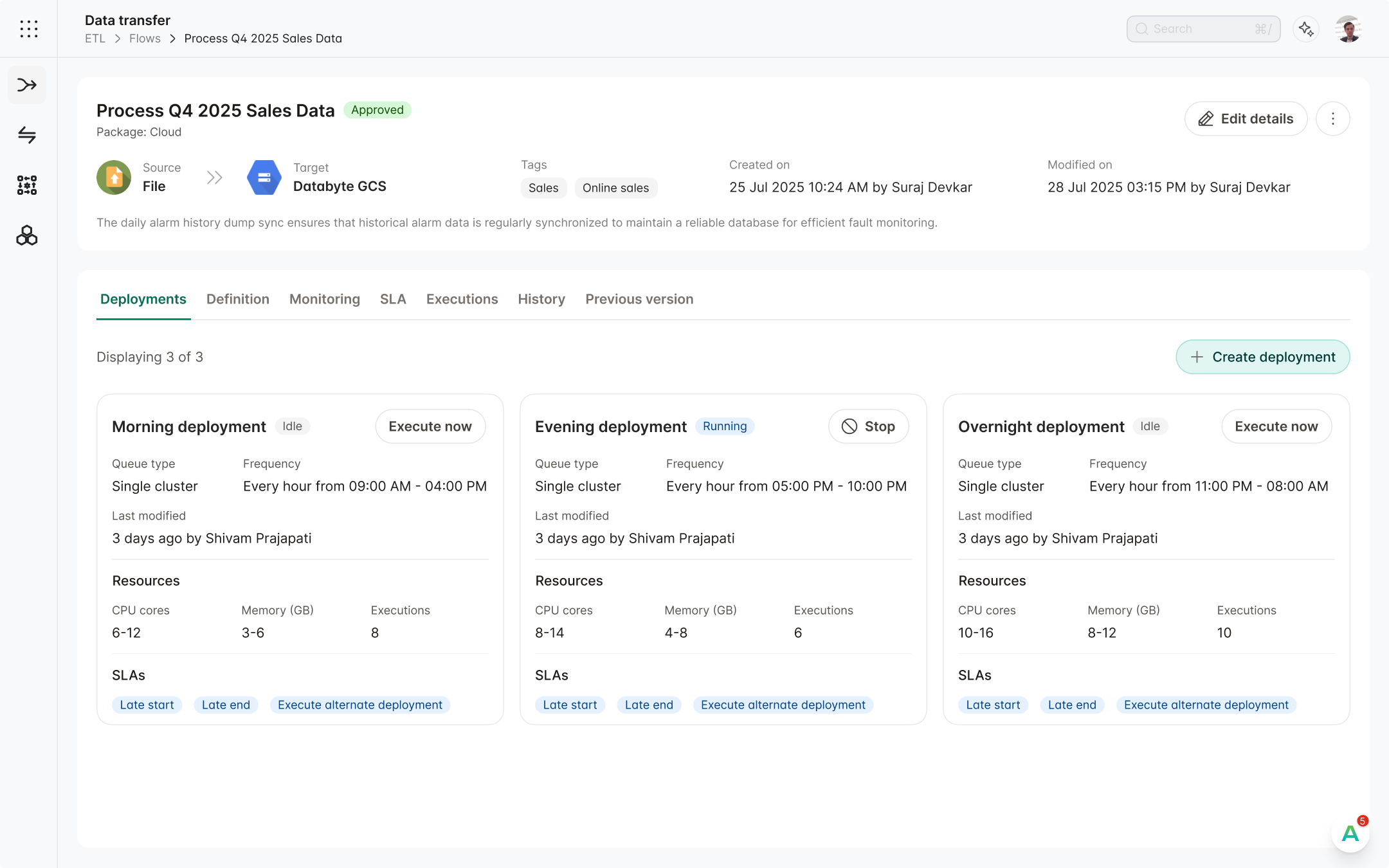
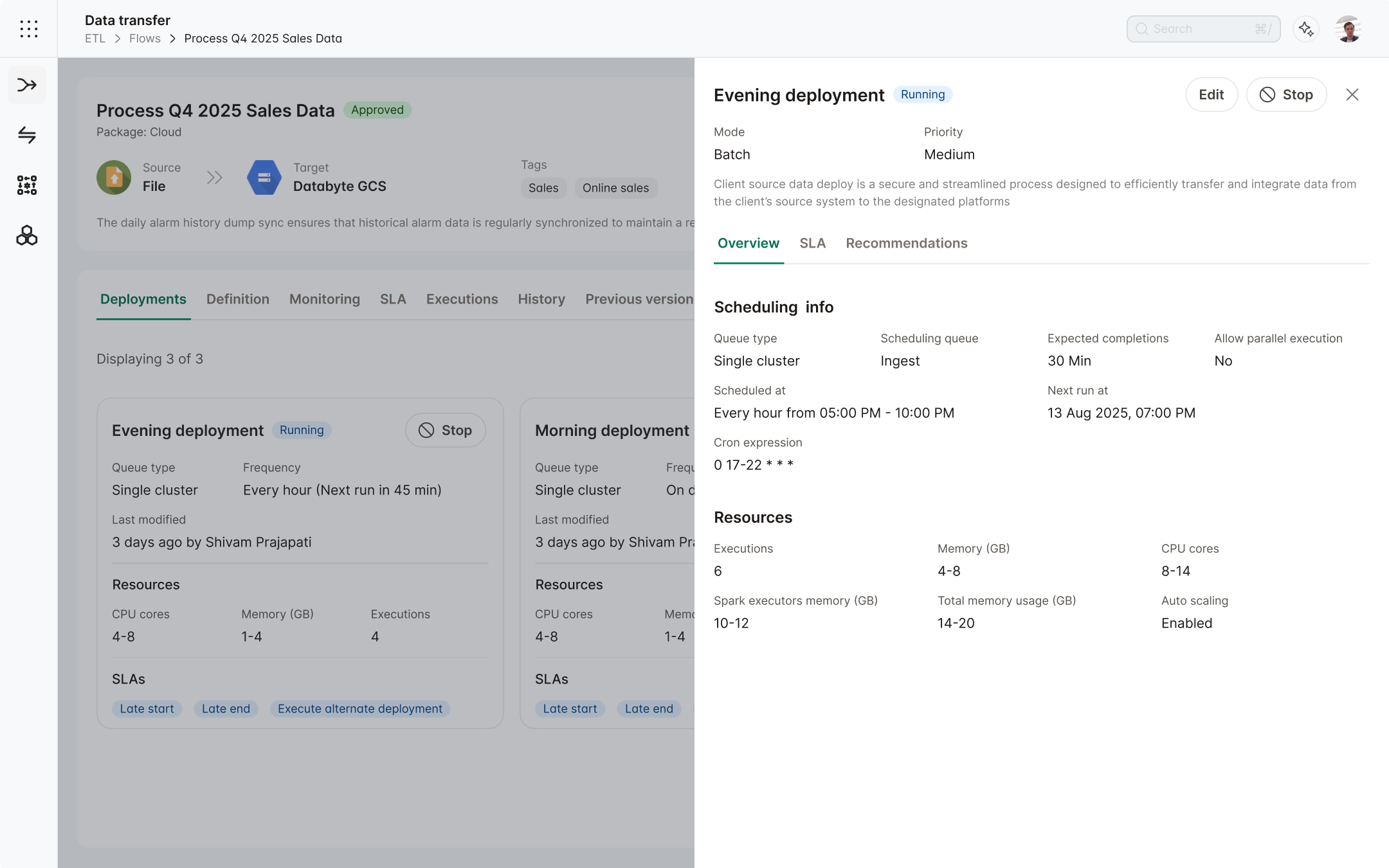
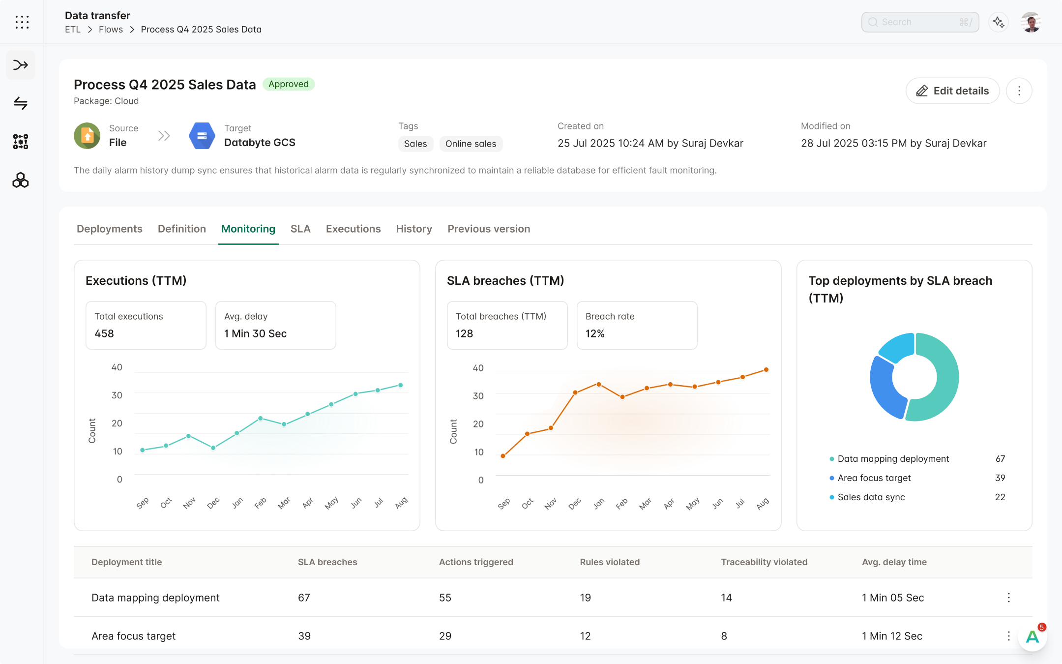
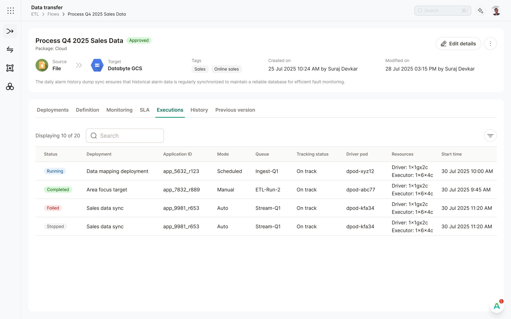
Flow View update
In almost every module, there was the same pattern of creating a flow and then creating a deployment over it. This is the representation of flow from our X to Y sub-module. The solutions provided here were also provided in all the other modules.
Problems
- Increase in cognitive load due to poor Information Architecture.
- No curated listing for flow executions.
- No proper monitoring or debugging features to understand failures or issues.
Solution
- Merged flow and deployment in all the modules.
- Added section of flow execution listing in each flow view screen.
- Added a new section named monitoring in each flow view screen for proper debugging.
Part of the Phase 2 Vision
The features discussed in the view screen were not implemented right away because they require more resources to be executed properly. For the time being, these features were put on hold and will be implemented in our next phase of updates.
The impact
Client was impressed by redesign
The client's exact words were, "The new design looks amazing and has improved far from the old one."

Advanced ETL became our star feature
This workflow builder was used in multiple other modules. By updating Advanced ETL, we achieved improvements in multiple other modules.
Built a fully tested design system in Figma
After the redesign, we also received a fully tested design system that can be used for updating other modules.
Designed for a Fortune Global 10 client
Working with such a large client taught me a lot about the workings of an established B2B product company.