
Back
Back Project overview The product The catalyst Design process Major challenges Final design Key decisions Outcomes & impact Learnings

Telecom GIS Redesign

I took full ownership of the UX redesign of our legacy RAN telecom tower management GIS platform. Acting as the sole designer, I rapidly resolved complex spatial data workflows and delivered unified interfaces across 8 distinct modules within 7 days.

Note: I've left out the company's name to respect confidentiality and keep the focus on the work rather than any brand associations.

GIS mapping UX redesign Enterprise SaaS Spatial data 1-week sprint
Telecom GIS Redesign UI

Project Overview

Rewamping a dense, usability-challenged GIS mapping system into an intuitive component that can be used in multiple modules throughout the application.

Role

UX Designer (Sole IC, GIS Module)

Timeline

1-Week Sprint

THE PRODUCT

Telecom GIS mapping system

The GIS mapping system was a heavily used component in our telecom-centric modules. These modules visualize telecom tower locations worldwide, enabling users to manage them effectively.

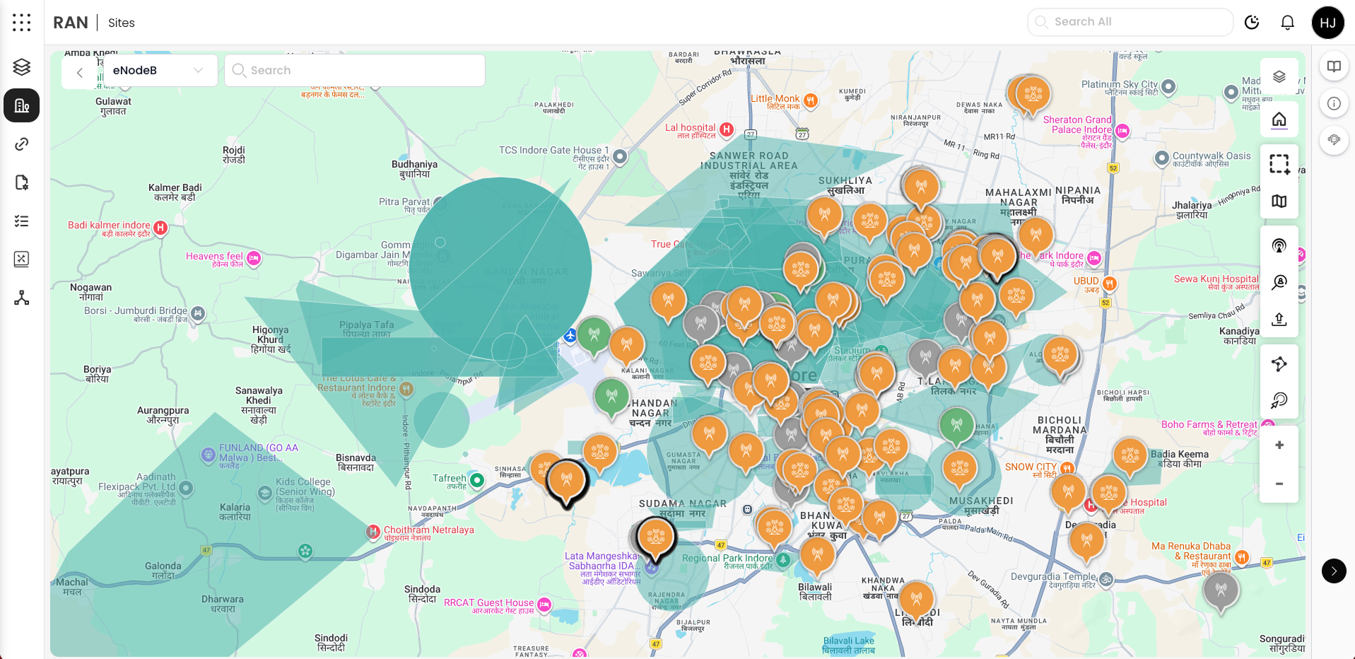
It was originally designed by us three years ago with a different mindset, but after multiple updates and new features, the product has become too complicated and outdated compared to current design trends.

This was not a greenfield project; the map was already deployed and running actively on client sites across multiple operational modules, including RAN, Topology, Warehouse Management, Logistics, and Coverage. Users relied on this live map to perform complex spatial analysis and make high-stakes infrastructure decisions.

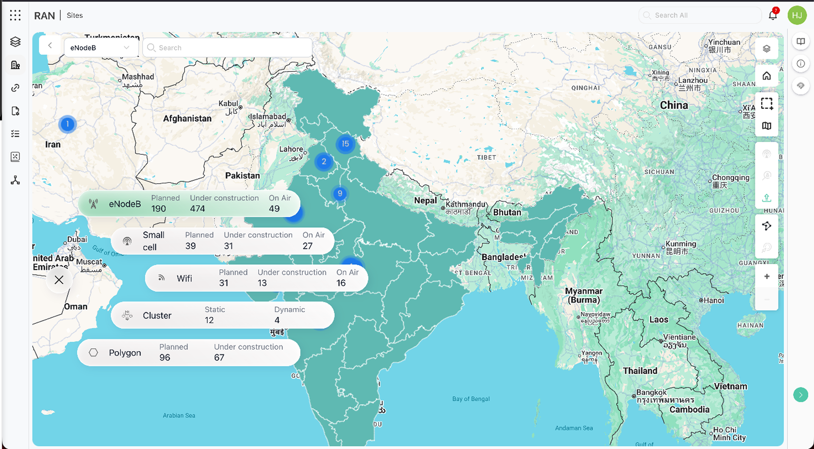
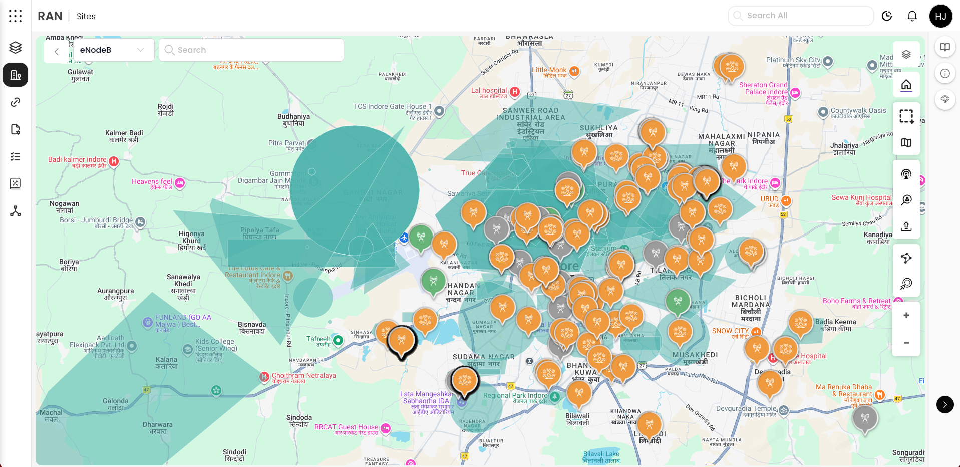
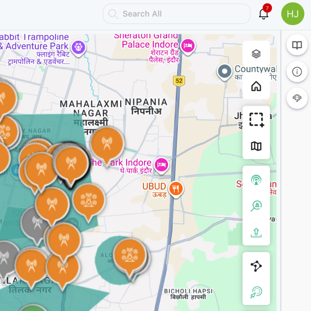
Old UI
THE CATALYST

From evaluation to execution

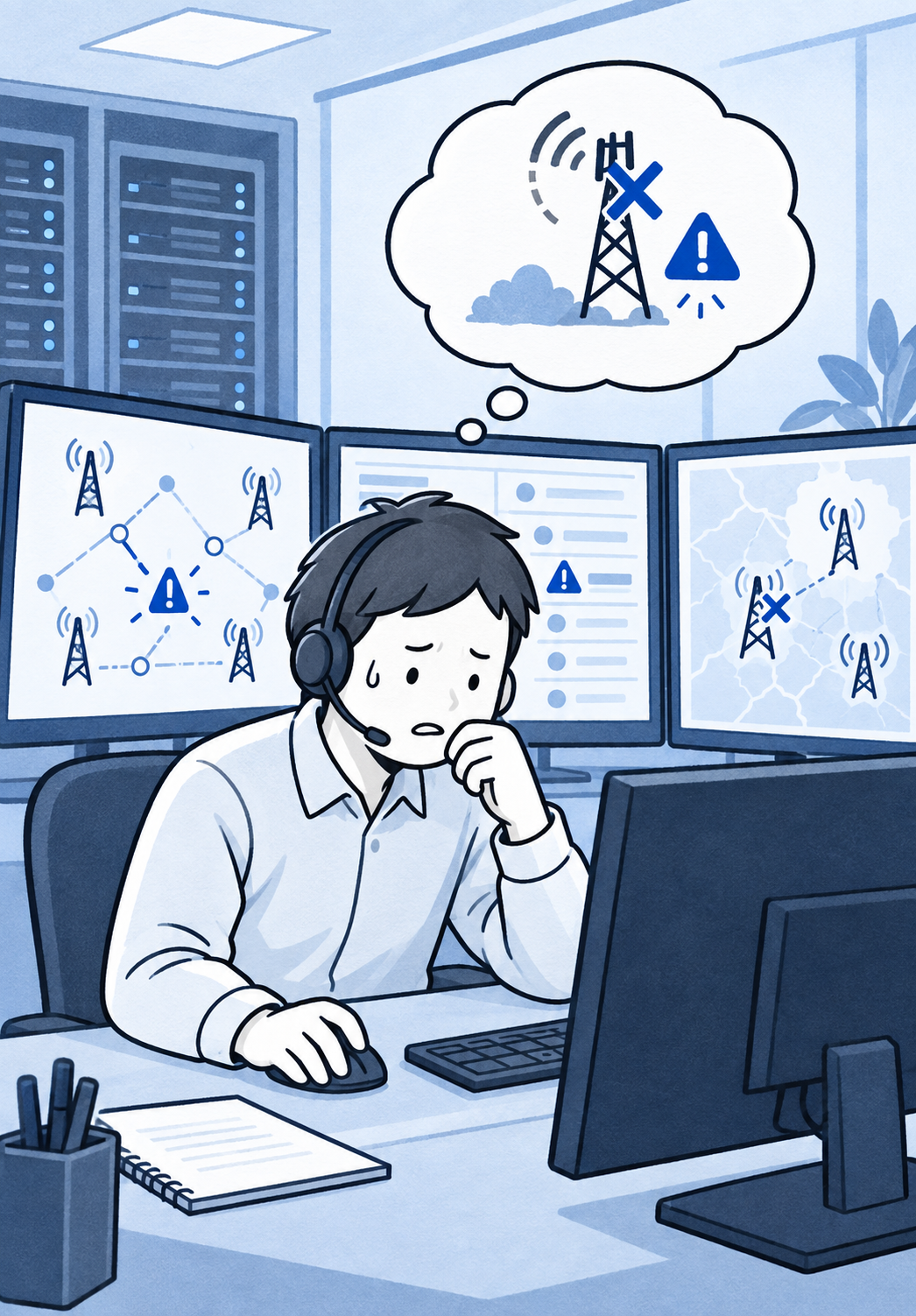
This project initially began as a standard Heuristic Evaluation of the existing live GIS module. However, after documenting the usability flaws, I realized that handing the engineering team a dense UX audit document would not effectively address the core interaction problems or bridge the communication gap.

I advocated for an articulated approach to this project and asked the design lead and the CEO for more time to find an effective solution. Based on my request, I requested 1 week to complete the task.

THE DESIGN PROCESS

Lean UX

The design process at VisionWaves was inspired by Lean UX which allowed us to maximize the design output in shortest time possible.

Lean UX process
THE CHALLENGES

Major Obstacles

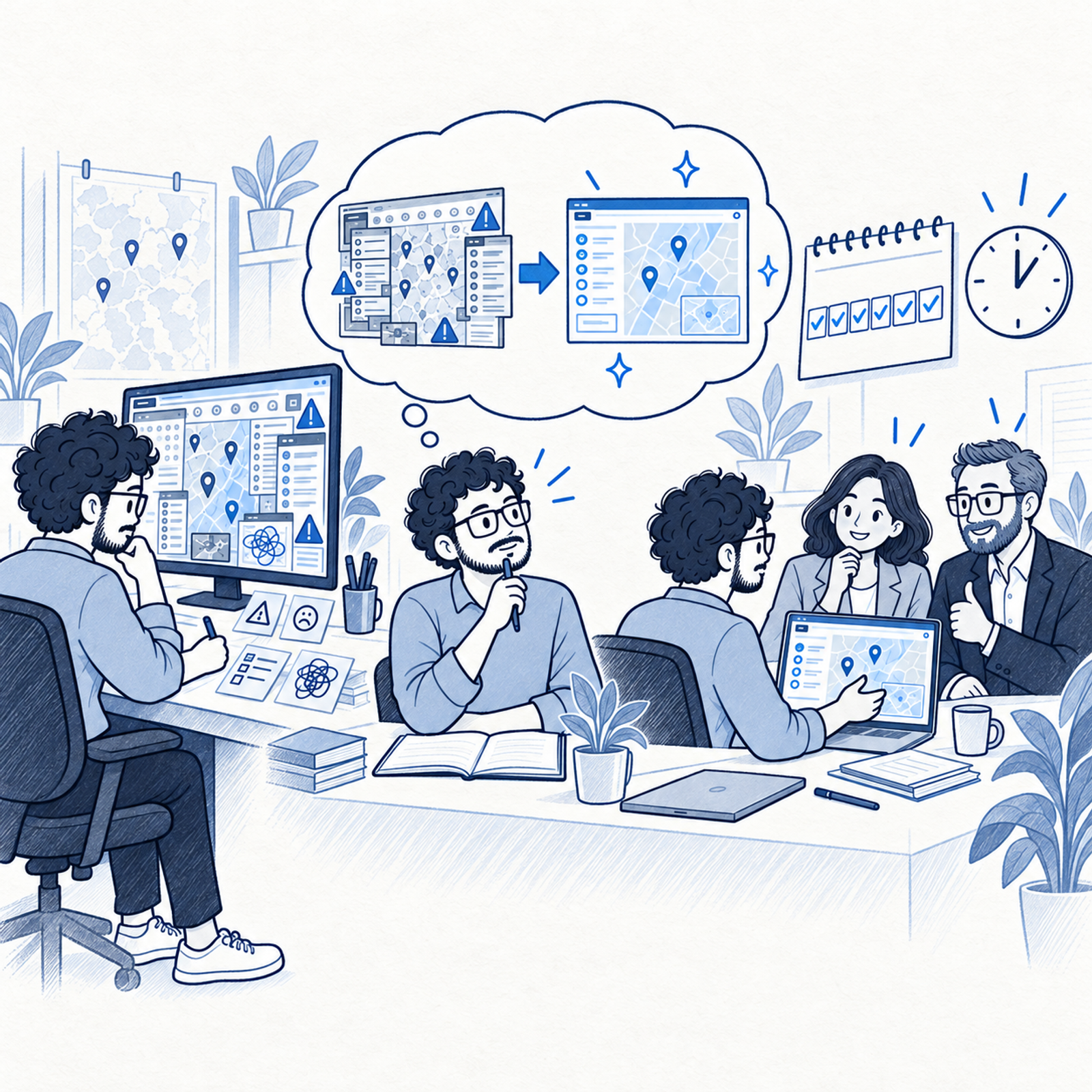
Zero User Access & Zero Budget

A strict 1-week timeline made rigorous usability sessions impossible, and no budget was allocated to recruit specialized enterprise users for testing.
Opaque Competitor Landscape

Direct competitive analysis was limited because leading enterprise telecom tools are not public.

Effective Design

We also had to implement major design improvements while keeping development efforts to a minimum.

THE SOLUTION

Final Design

Rather than being blocked by the constraints, I overcame them by focusing heavily on heuristic principles, conducting competitive analysis from similar GIS products, and leveraging my own technical background. I collaborated closely with the Development Lead to validate technical feasibility, ensuring every design decision solved a real operational constraint.

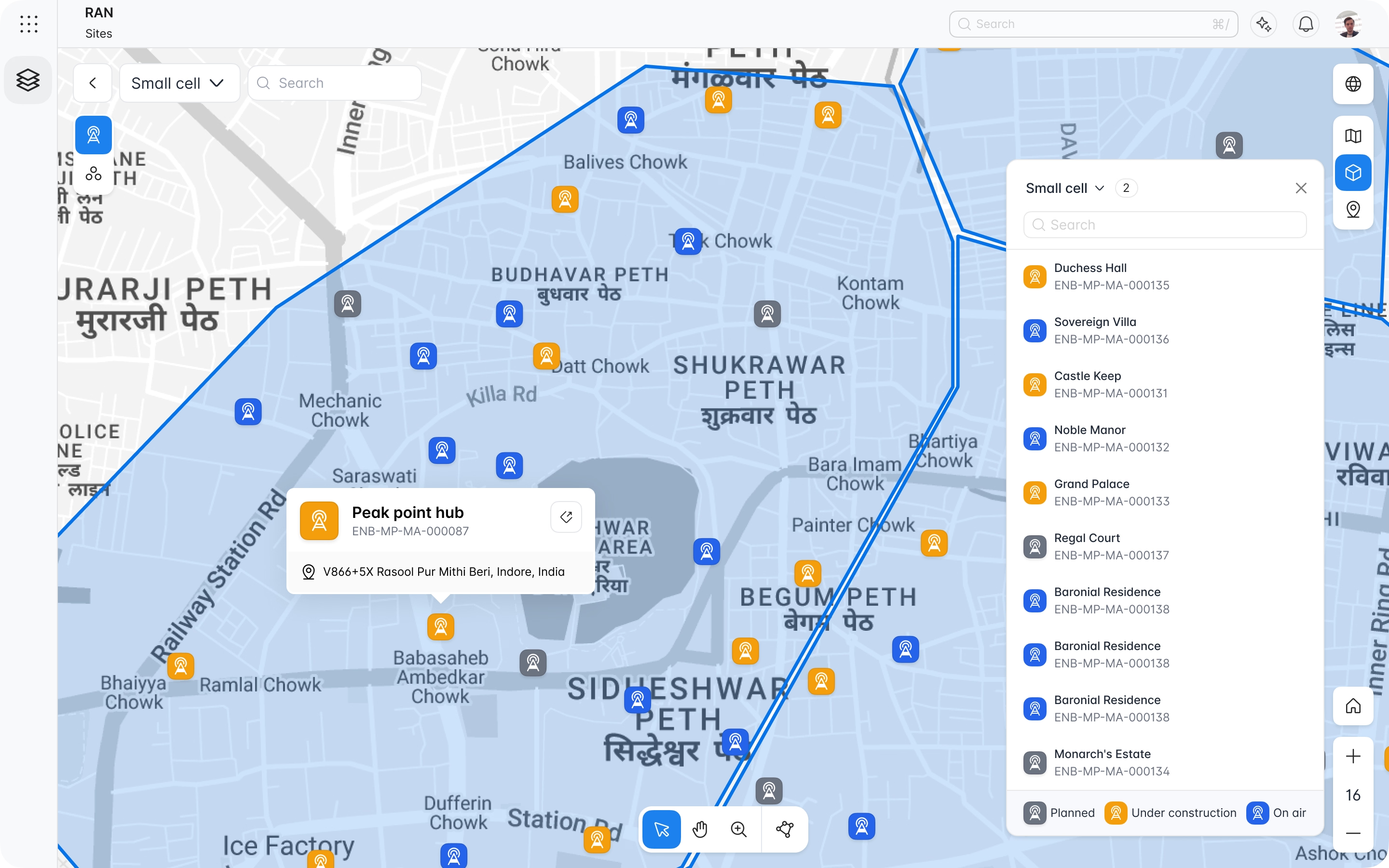
High-fidelity GIS mapping before-and-after screens
KEY DECISIONS

Key decisions based on impact

Map theme update

The Problem

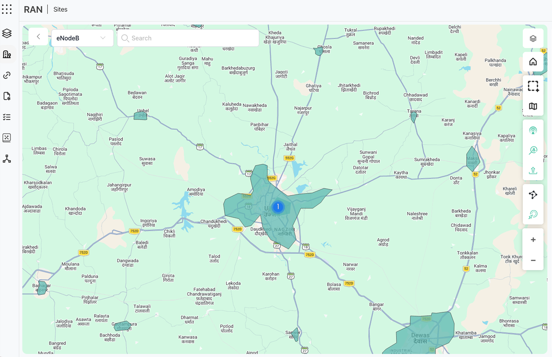
For the map, we were using the Google Maps API, which supported multiple themes. In the previous version of the GIS UI, the “Standard” theme was set. It displayed multiple layers on the map, such as Terrain and Grasslands, which were unnecessary for the user managing and tracking the site status, and increased the user's cognitive load.

Map Theme Change

The Solution

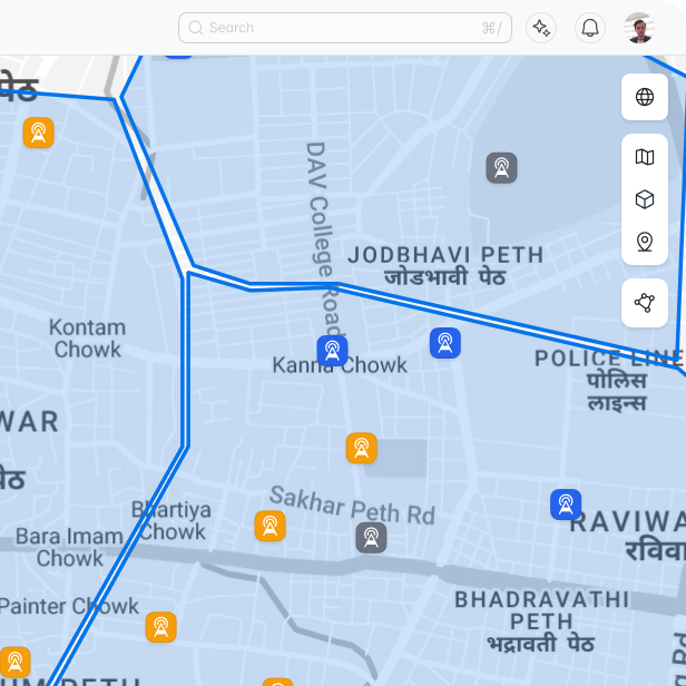
We updated the map theme to “Silver”, which removed most unnecessary elements from the base map for 9+ modules and instantly improved the UI with minimal Development effort.

Along with this, we updated the Map pins' style and size to make the UI more visually appealing and reduce clutter when multiple sites are present in one area.

These small decisions made a big impact on the overall UI.

Map Theme Change

Site type navigation update

The Problem

The site type navigation component was built for a specific module named “RAN”, which has several usability flaws, such as:

  • Ambiguous Interaction: The component lacked clear affordances, resulting in highly unpredictable behavior. It was visually unclear whether interacting with it would serve as a map filter or would navigate to a totally different UI.
  • Visual Inconsistency: The component's styling broke the established design system. It used the glassmorphism effect, which was inconsistent with our flat UI theme, and its shape did not match the theme either.
Map Theme Change

The Solution

For this, we updated the component's design, making only the KPI value a clickable hyperlink with an arrow icon on the right to clearly indicate to the user.

Site Type Navigation Change

Introducing Site Clustering and Layer Navigation

The Problem

In high-density network areas, the map suffered from severe marker overlap. This hid critical site data, directly impairing the user's ability to monitor regional health or make accurate, at-a-glance infrastructure judgments.

Map Theme Change

The Solution

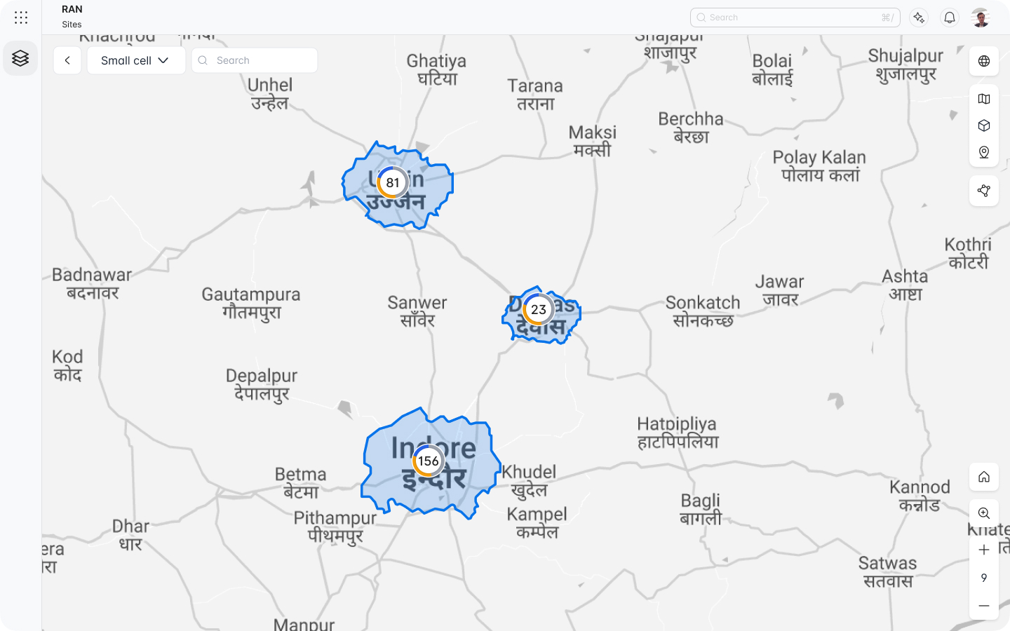
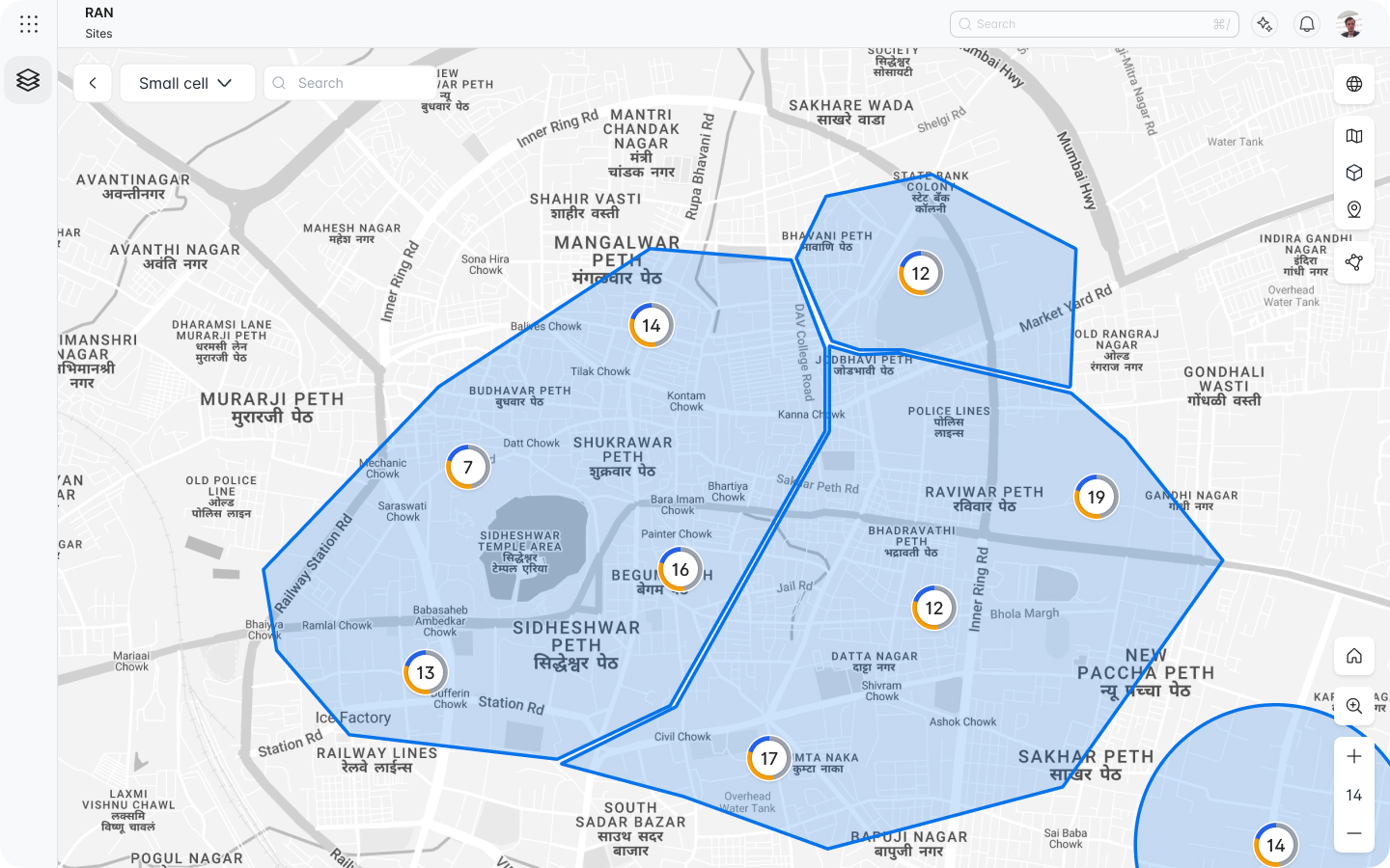
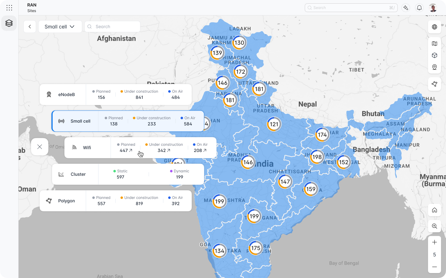
I resolved this by introducing dynamic map clustering, paired with a synchronized layer panel.

  • The on-map clusters use a donut chart to summarize the status distribution of the grouped sites, allowing users to read the data without zooming in.
  • Simultaneously, the layer panel acts as a structured, searchable list view, allowing users to bypass the visual clutter and quickly find the exact site they are looking for through direct data filtering.

The idea behind this emerged from the competitive analysis we conducted.

Site Clustering & Layer Navigation

Removal of unnecessary features

The Problem

In our first presentation to the CEO, we received feedback to remove site creation features from the map. This was based on the complexity of site creation, which will always be done via a form. This is because, when creating a site such as eNodeB, the user will be required to provide a precise location for the site, which will be derived from the latitude and longitude data provided by the user and not by randomly clicking on the map.

Map Theme Change

The Solution

There were 4 different buttons across multiple modules on the map, used to create a site on the map. We removed all of them, discussed with the product manager, and got approval. This is how we reduced the user's cognitive load.

Map Theme Change
OUTCOMES & IMPACT

Executive buy-in & scaled delivery

The 1-week sprint culminated in a high-stakes presentation to the CEO and executive leadership.

Production-Safe Scalability

By prioritizing technical feasibility and scalability, the UI patterns I established were immediately approved and safely scaled across 9+ live modules.

Executive Buy-In

The CEO explicitly praised the attention to detail and my ability to balance UX improvements with engineering reality. The presentation secured my reputation as a strategic thinker within the organization.

Core Takeaway

Usability is not about adding more features; sometimes it’s about removing the unnecessary ones and focusing on the right things.